5-10-5: Kate Blairstone, Illustrator and Print Maker
In a twist of fate, I had not realized that the Kate who had waited on our table during my February trip in Portland was a talented artist herself! Only a month later did I happened on her floral prints in her Instagram account. Her webpage is as colorful and cheerful as her personality, and Kate recently launched her online shop selling a few prints (I particularly like the Euphorbia print).
 Please introduce yourself.
My name is Kate Blairstone - I'm 33 and live in beautiful North Portland, Oregon with my husband, dog and two cats.

The arts or horticulture?
Both! I find that my many creative outlets inform and pollinate one another - it just depends on how much time there's left in a day.

Did your interest in gardening develop simultaneously with your professional development in art?
Yes, in that they developed next to each other - it's only recently that they've really overlapped. I've always been an artist, but it's only since I've become a homeowner that I've been able to call myself a gardener. You have to have a garden to garden, right?
Like most creative types, you have a full time job at the Portland institution Besaw's that pays your bills while you are able to produce your artwork, namely prints. How do you juggle the demands of a full time job that can limit creative output?
When I first started at Besaw's, I used to feel like the work depleted my creative energy available for my own outlets. In the last year I've been focusing more on my creativity as a practice, which really means that I can compartmentalize my output in proportion to the activity I'm working on. I'm much better at allocating only a certain time frame to a work project. I'm more efficient.
I've been successful at building my art practice at home by creating parameters for my work: a consistent format, process, and schedule. I feel the same way about my garden - it takes ongoing maintenance. It's always evolving, and if you don't stick with it it can get away from you. My husband is also an artist, so we've made our studio time something we do together.
Creativity can be capricious - funneling it into a productive and lucrative endeavor is always a challenge facing creative types. It's all too easy to elapse into a dilettante when priorities divert commitment. Do you set aside blocks of time closed off to interruptions and obligations?
I try very hard to limit my social obligations, which has been a funny transition as I've come out of my 20s. I used to worry over not having enough time to do everything; now I'm just much better at scheduling my time. I'd love to build my practice into a sustainable career, but at this point I'm happy to be able to create consistently. It's gratifying to be able to see your own progress and track it over time, rather than waiting for inspiration to strike.
Artists sometimes take years to refine their techniques before they are almost confident of them. At the same time their styles evolve with age. Sometimes mastering a new tool that can bring a new dimension to your work can add to the development process. What did your education in printmaking teach and did not?
I have a funny relationship with art school. I've always been someone who's taken to lots of interests, so in some ways my choice of Printmaking as a course of study was a bit arbitrary. I transferred to art school because I wanted to take more art classes. I started out in Photography but decided I didn't like that because it wasn't hands-on enough, and the Printmaking department at the time had the most agreeable faculty.
I didn't use any printmaking in my work for years after college, and still don't print my work myself, but I think it shaped my way of image-making. I tend to think in terms of surface design and flatness; I love textiles and folk art, the way craftspeople have been interpreting the world around them for hundreds of years.
How often do you play around with colors and spacing until you are satisfied with the resulting print? I find it overwhelming to pick out colors that really complement or scream the personality of the plant whenever I set to depict it in paintings.
I usually start out with a realistic color portrayal, and then stray from there. It's funny - some pieces are much easier than others. Sometimes I get the color relationships where I want them right away, and sometimes it takes hours. It doesn't help that I tend to like unexpected color combinations. I love the filters in VSCO - I like to play with screen shots of my work on my phone. Sometimes the filters will tweak colors in interesting ways that I hadn't considered. Placement is much easier, as I try to work within the same format every time.
You enjoy collecting antique Asian ceramics. I detect a similarity between the floral motifs on these ceramics and those of your work - sometimes the juxtaposition of colors recall Asian pairings rather than Western ones. They seem lurid in the mind but they always turn out beautiful and contemporary. The Austrian-born Swedish artist and designer Josef Frank's work comes close in the Western world.
I love both those comparisons, thank you so much! I work often in ink, so I look at a lot of Asian porcelain, which often has a very similar line quality. I also find that the flowers and foliage depicted are often of actual plant species, rather than imagined ones. As I get to know different plants through both horticulture and drawing, I feel that I'm connecting to a long history of botanical surface design. I enjoy recognizing the plants others have drawn as well - peonies, dogwood, bamboo, chrysanthemums & bonsai - especially on antique pieces.
Josef Frank's surface design has a similar feeling of flatness and layering, partially because we both use similar production methods. I love love love his overgrown and colorful aesthetic.
Lately I've been digging 60s and 70s illustration and surface design - the psychedelic color relationships remind me of golden hour in the garden.

Do you have a preferred medium or media in which you render your prints? Are graphic design programs or digital printing part of the process?
I love working in ink - that's how much of my work starts. It can be loose and heavy, or light and scratchy. I build up parts of each plant in layers of ink on tissue paper. Then I scan each layer, and colorize them in Adobe Illustrator. It's instant gratification, but also keeps my work hands-on for much of the process.

Retro prints are enjoying a revival as people crave bright colors as an antidote to our modern, monochromatic styles. Have any of your prints been reproduced for wallpapers and home decor?
I've sold work for home decor, and would love to produce a line of wallpaper. That's my dream! If I could have wild prints everywhere I would.
No plant seems to escape your attention - orchids, succulents, euphorias, and even temperate woody plants have been immortalized in your bold and colorful patterns. Where are you likely to seek plants for floral and botanical inspiration?
I help with social media for the Hardy Plant Society of Oregon, so when I get a chance, there are many fabulous open gardens throughout much of the year here in Portland. I also take tons of pictures everywhere I go. I often pull off the road when driving to take pictures of plants!

Portland has a vibrant horticultural community that benefits from its ideal climate for plants. What are some of your favorite gardens and nurseries to visit in Portland?
I love to visit Joy Creek Nursery in Scappoose and Cistus Nursury on Sauvie Island. On a sunny day, that beautiful drive (plus free chocolate chip cookies at Joy Creek) is my favorite day trip. This year I went two weekends in a row to Schreiner's Iris Gardens. I am now a huge huge fan of iris. I love getting to see a huge variety of the same species all together like that. I also love the Rhododendron Species Botanical Garden and Pacific Bonsai Museum outside Seattle. So good.
Any advice you wish to impart to those seeking to blend their artistic ambitions with plants and the greater natural world?
For me, making art is about seeing, observing. It is also a practice. Going out and looking at plants, working with plants, studying their structure and growth season all contribute to understanding how they might translate artistically. I favor illustration and printmaking as well as folk art when looking for inspiration (and comparison); it's not about realism, it's about style and mood.

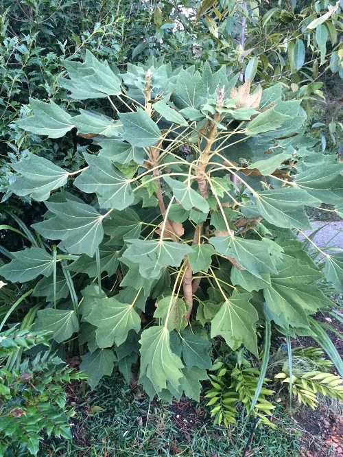
If you do have a garden, could you say that it is an extension of your personality you confidently exhibit in your prints? I imagine a garden full of graphic architectural plants paired with softer romantic ones - such as the dogwood with Tetrapanax you posted on Instagram.
My garden is two years old, and started as a very weedy patch of grass. Much of it is still that way (we're gradually working on that), but it's now much more colorful. My husband and I got married in our backyard last August, so I spent a lot of time last year creating my "wedding garden": brugmansia, Yucca rostrata & lots of kniphofia. As Mexican as possible! I think you're right, though, my favorite combination is my Tetrapanax and white Japanese anemone. As my friend Kate Bryant says, they're gonna fight it out!
Your desert island plant?
Can I lump all the poppies together as one plant? If not, I'm in love with Lewisia. #OregonNative!
We creative types never cease to have something coming along shall our interests flag. What projects do you have in the pipeline?
My husband and I recently went to Croatia for two weeks! I saw and drew as many unusual Mediterranean plants as I can. After that, I have plans for some limited run screen printed editions and hopefully some wallpaper!
Select 6 prints and explain briefly their inspiration behind them.
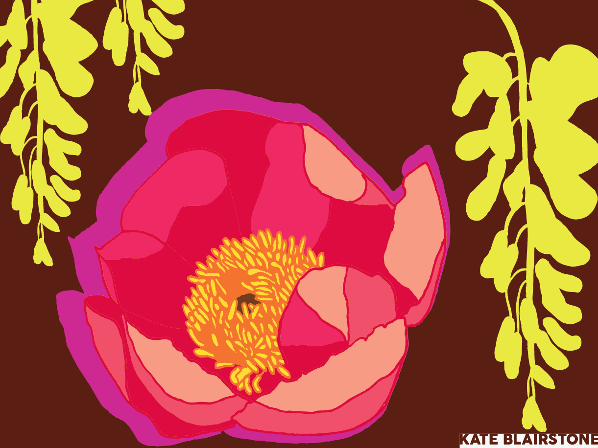
Peony & Wisteria: Honestly I was surprised that these bloomed together this year. Am I crazy? I was looking at vintage Uzbek Russian Trade Print Cotton fabric at the time - which is loud and bright and floral and retro: a fun eBay search when it pops up.
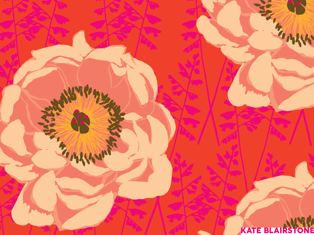
Itoh Peony: My Coral Charm bloomed, and it was amazing! I was playing with grass textures, and enjoyed the juxtaposition. One of my favorite design challenges is "Vintage 70s Tea Towel."
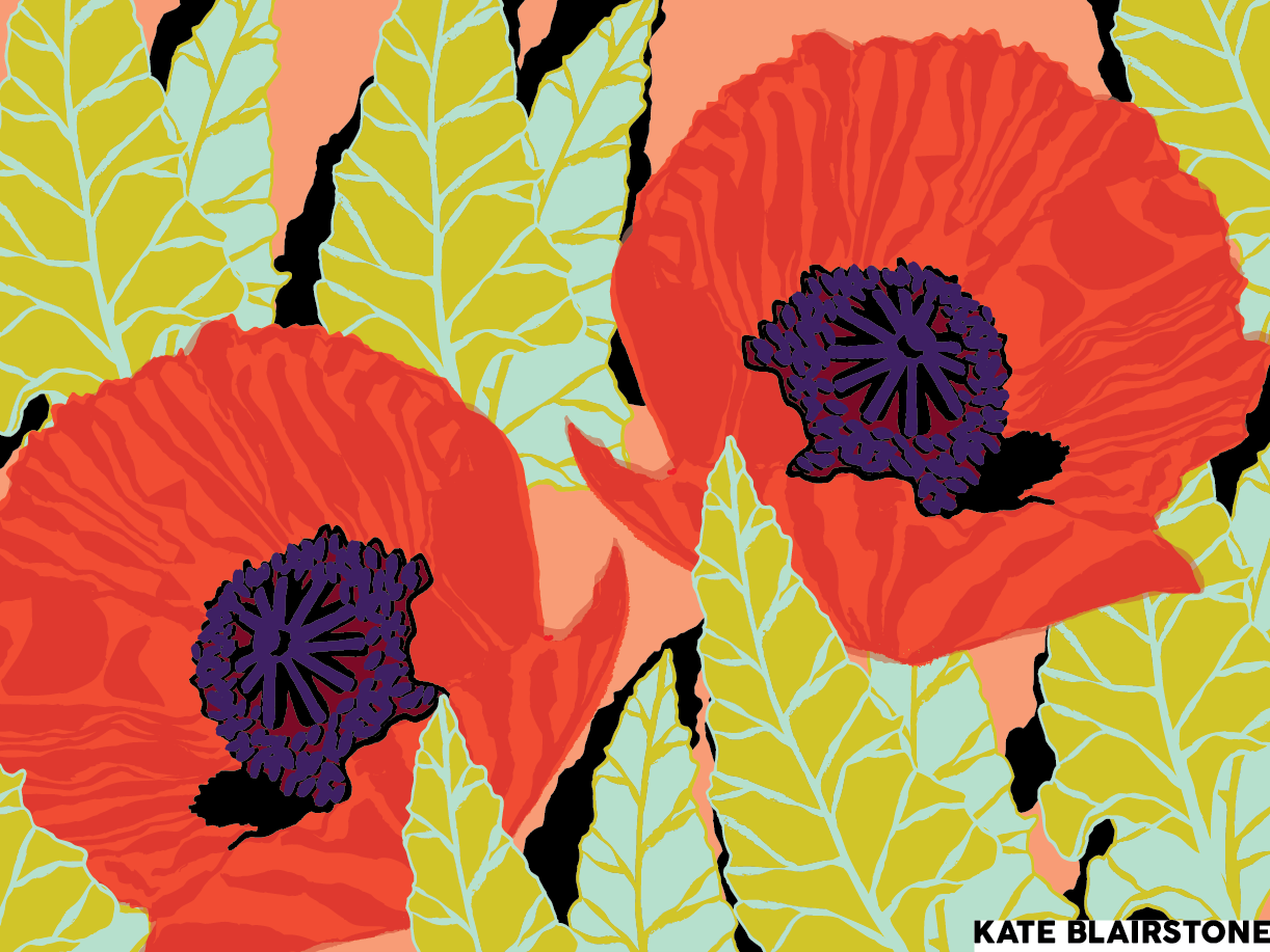
Poppies: I often work in flat, digital color, so I'm always looking for ways to imply texture. This was another 70s Tea Towel Challenge- but maybe somewhere in the Mediterranean.

Aeonium: For a while we didn't have a scanner, so I was taking pictures of my ink drawings with my phone, emailing them to myself, and then manipulating them in Photoshop and Illustrator. A pain in the ass, but an unintentional, happy result is the way the layers are offset. I like that hand printed, vintage feel. I studied this aeonium for a long time while drawing; it's great meditation.

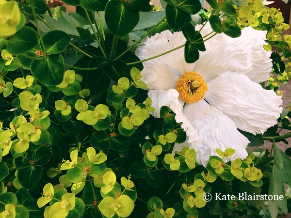
Euphorbia: This Euphorbia griffithii 'Fireglow' was one of those plants I thought hadn't made it - there's a good amount of neglect in my garden - and it suddenly reappeared this spring. I love that bright center; the huge clump of it at Joy Creek is one of my favorite things in their display garden.
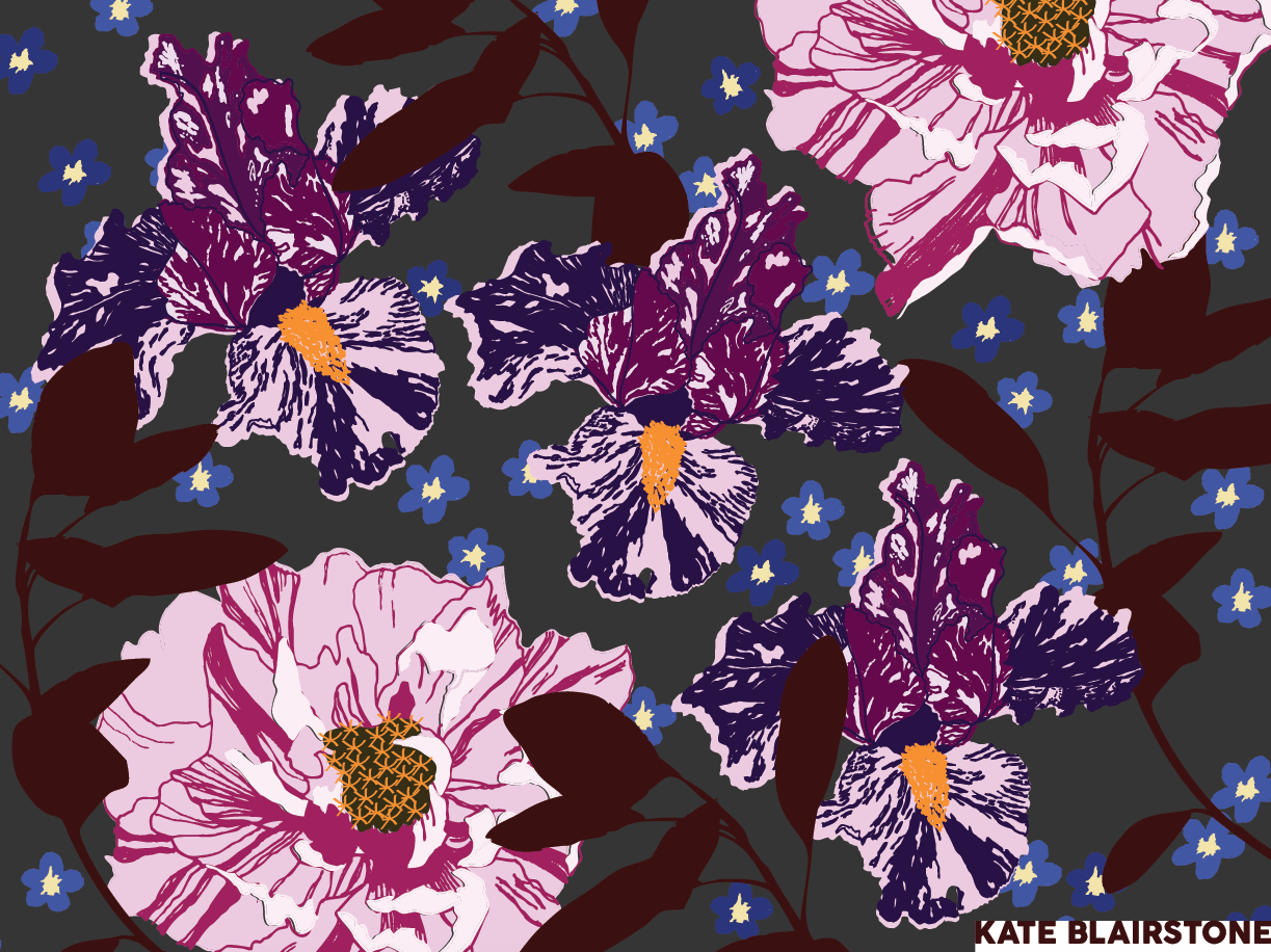
Peggy Anne: I love illustrating variegated plants. It's a way to gradually convince myself that they'll be cool in my garden. I spotted Peggy Anne on my visit to Schreiner's. Adelman Peony Garden is just down the road, which made for a fabulous nursery trip. Those splotchy Itoh peonies were a natural pair - I wish my yard were that adventurous!
Thank you Kate!
~ Eric