Chelsea Flower Show Exhibitions
This year the RHS Chelsea Flower Show was celebrating its 100th anniversary and as the English horticulture event of the summer, it was not to be missed. Each year the gardens vow to bring it bold and bring it big with 2013 being no exception. The crowd was out in full force despite the chilly spring weather that we have been experiencing lately. This cool spring was also apparent with the plants being used in the gardens that were still being held back in tight bud. Together we, and E and I, will take a look back at three of the Designer Exhibition Gardens and discuss the ideas behind them, and why it worked or not.
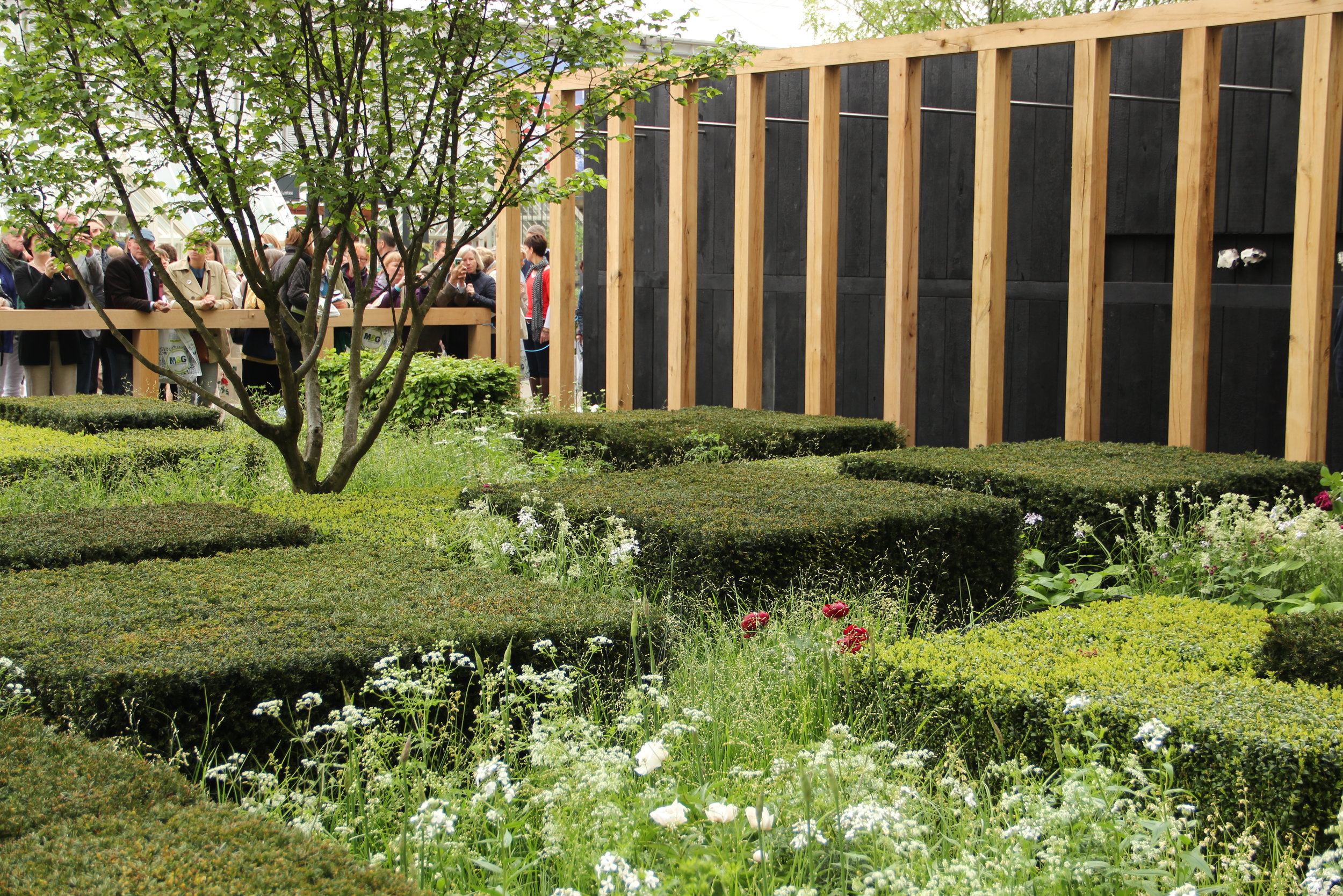
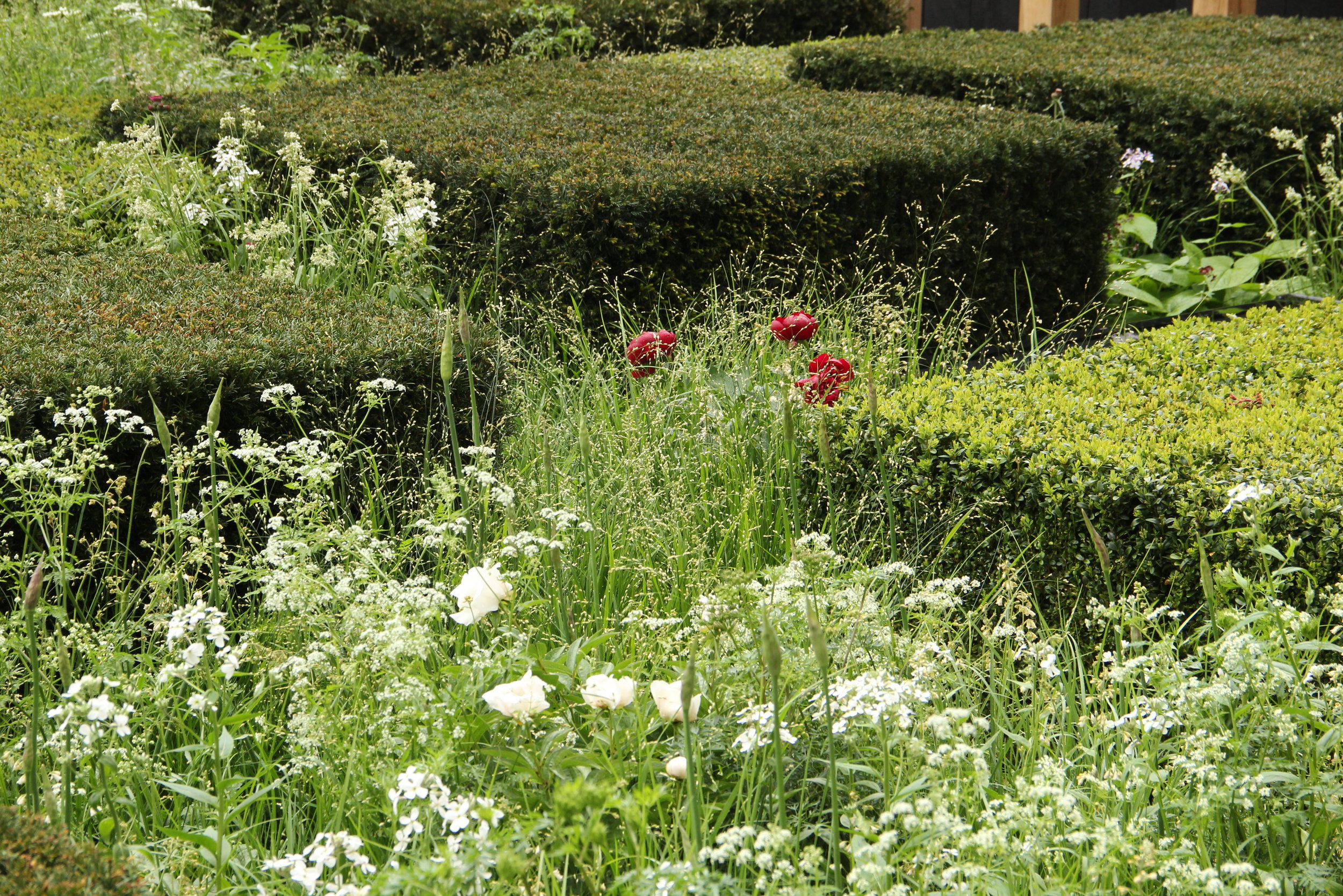
The first garden, designed by Christopher Bradley-Hole, for The Telegraph, was a modern and abstract interpretation of the English landscape encompassing woods, hedgerows, fields and streams. He stated his influence came in the form of Japanese design and a wooded estate he is in the midst of restoring. The only 3 trees present were Corylus avellana which are commonly found throughout the English woodland. The sheared cube shaped shrubs that were used are Buxus sempervirens, Taxus baccata, and Carpinus betulus, representing woodland and hedgerows which were then interspersed with meadow type plants, such as grasses, annuals, and perennials.
J- When looking at these gardens I try to imagine being enclosed in the space and how I might enjoy myself while walking through them and how it would look while approaching from different viewpoints. I love looking at the plants up close but this is difficult since people are restricted from entering the gardens, due to this the minute details that a plant offers are sometimes lost on the visitor. Taking the exhibition garden in as a whole and contemplating if I would enjoy spending time in this garden. The overall effect the Telegraph Garden had on me was excitement, as it had enough going on to keep my eye busy, a subtle yet soothing color palette, and was beautiful and interesting to look at from any angle.
E- Interestingly I tend to evaluate the overall effect first even if my eye inevitably goes to the planting by asking myself the following: Can I see myself being at ease in the garden? Is the garden harmonious in its disparate elements? When Christopher Bradley-Hole's preliminary plans were published online, I was concerned about the canopy of the Corylus avellana and the scale of the clipped shrubs. Having seen the photographs of the finished garden, I rest my case because there is enough negative space around the beautifully limbed-up trees that the panels of clipped topiary and loose herbaceous plantings can be admired. I liked how you could view the garden from the different sides under the oak timber colonnade.
J- The garden design here was very plant heavy which is always a win for me. There was not too much hard-scape going on except for the oak timbers in the background, which, with its contrasting repetition against the garden, helped to define the space and set the garden off very effectively. The garden got most of its structure from the clipped shrubs, which could easily have made the garden too static, but the plant choices mixed throughout the design really helped soften this linear effect and gave it life through movement from plants swaying in the breeze. It made me wonder if the whole garden would have appeared too heavy if a more intense color palette would have been used, thus making me more appreciate the lightness in the plantings present.
E- The major challenge for garden designers at Chelsea is the balance between planting and hardscaping - sometimes the show garden tilts heavily towards planting while at other times hardscaping dominates instead. I am typically biased towards plant-centric gardens, although I am aware that such gardens, if not tamed carefully, can be a muddle. Here Christopher Bradley-Hole's abstract interpretation of the English landscape is more plant-driven without compromising the hardscaping. His interpretation has succeeded for the sheared shrubs capture its mosaic-like patchwork and the looser herbaceous planting the mixed hedgerows (I remember distinctly seeing the English landscape from the airplane during my transatlantic trips). The Japanese restraint comes in the catholic use of plants and spatial orientation of the hardscaping features. I do question the use of boxwood (Buxus sempervirens) especially in this hard-sheared form since boxwood blight has badly decimated European gardens - if boxwood was actually used, it can develop unsightly brown patches from the blight. Unfortunately, not many plants can withstand the same pruning or produce the same effect as boxwood. The oak timber colonnade provoke mixed feelings for me - I find them to be beautiful, but uncertain about their unfinished look, which looks like construction scaffolding. Some weathering or conditioning for a time-worn effect could have been better and created a link to the earthy natural colors.
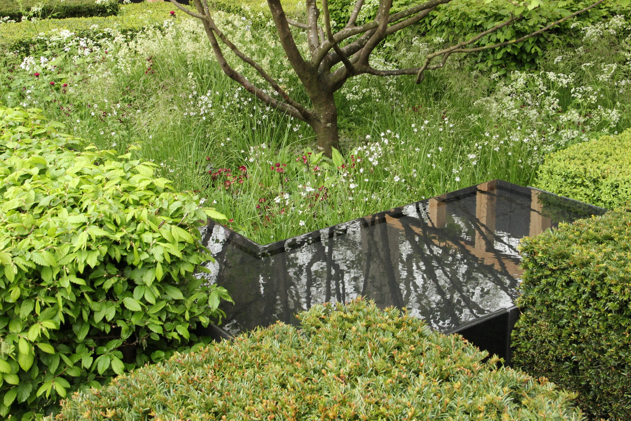
J- There was a slyly placed water feature comprised of many right angles which was to represent a meandering stream. The shape of this and its placement, which was the perfect link uniting the clipped forms, plants, and trees, were crucial to making this feature a success. The 3 Corylus trees were just enough to add height and another layer of green canopy, it became another layer of green held above a flat plane of clipped shrubs. With the pool of water which was only visible at certain angles it created a pleasant surprise moment in such an open space. When catching your eye, this water feature allowed the reflection of the tree canopy to be visible from another angle below giving even further sense of depth to this space.
E- Water is an essential part of the English landscape and to ignore it here would have been a significant oversight. Bradley-Hole has been careful to capture the right reflection in the water feature. A garden designer had to relocate his water feature at Chelsea a few years ago because the reflection was that of a sculpture in a competing garden. The water feature elongates the oak colonnade, creating another depth beyond the flat plane of shrubs. Had the sole dimension been the tree canopy, the garden could have fallen unflatteringly flat. Water has a way of highlighting details overlooked on initial impression - consider how your attention is drawn to the sculptural limbs of Corylus avellana. A nice touch is how the black surface echoes the dark green sides of the yew while offering a textural contrast --yew being rough, water smooth.
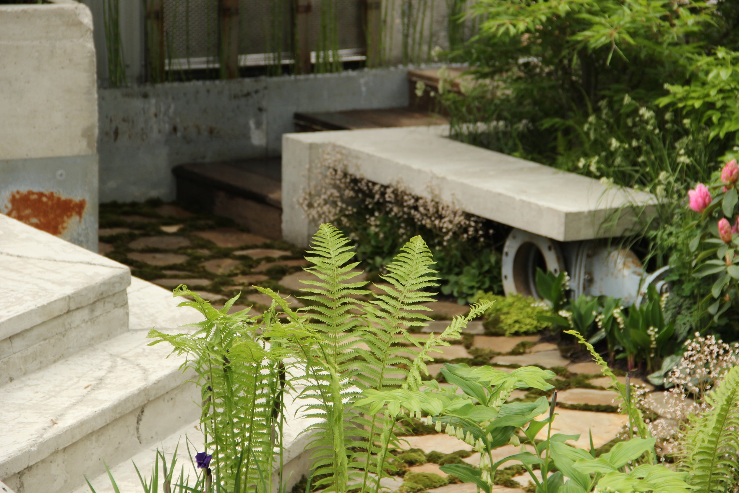
Kate Gould was the designer for this small space which was listed under the urban garden category. Wasteland, the name for this garden, was inspired by her walking in and around London and seeing the possibility of creating beauty in abandoned spaces. The idea was for this garden to be created in an abandoned water pumping works station. The plants that were picked out were chosen for their naturalizing properties, which could flourish in these abandoned areas.
J- Though this garden is heavy on hard-scape, which normally l don't like, the garden really made me smile at its cleverness. The layout of the space, which can make or break a small garden, had fluidity due to its circulating path around the center pool and was very important in not giving it a static feel. The thing that I realized when I saw this garden was that all of the hard materials used were not shiny and bright, something that is so common with these exhibitions, and by using these recycled materials, a sense of history was already created helping to create the character of the garden; it appeared unpretentious. The plant palette was enjoyable, though color wise I would have strayed from the more feminine colors and played up the masculinity of the hard materials used with more with textures, and yellow or blue blooms. Definitely this would be a garden I would enjoy having with the sound of the trickling water, and the cooling cement structures that is so welcome in otherwise hot urban environments in summer, just imagine the future with it filling out with the self-sowers and watching the moss taking over.
E - When one visualizes abandoned urban spaces, the feeling is of melancholic decay and positive renewal from nature reclaiming what we humans have destroyed. Kate Gould's garden certainly leans more towards hardscaping, but the materials are ingeniously used and the muted colors played well into the theme. I liked how the concrete benches have rough edges and some discoloration, and the recycled bathtub as an outdoor chair is clever. Given the garden's tentative location by the water pumping station, the sound of water enlivens it and gives a natural foil, apart from the plants, to the hardscaping. Gould has circumvented the space constraints by allowing her garden to flow around the water feature, which is the garden's heartbeat. However, planting here is a bit too tidy for that effect - spontaneously breaking up the hardscaping with a plant here and there could have reinforced that 'abandoned' feeling. Colors do appear uncharacteristically timid against the masculine-like space - I craved something bolder and wilder. As much as I like rhododendrons, they look somewhat out of place here! On the other hand, Gould's choice of the underused Enkianthus campanulatus deserves kudos.
J - The moss that spreads through the paving helped create a sense of age in the garden, softening what could have just come off as a hard and cold area among the other many other hard materials. The far reaches of the Bauhaus effect, due to its pared down details, lets the space emphasize functionality rather than heavy design, and lets the plants, with the small changing details they possess, be the highlight of this garden. The old claw foot tub cut in half is just another bonus in this well-thought out and inspirational garden.
E - The contrast between the moss paving and the concrete steps and seating is a striking one. It helps that the concrete is not a glaring gray and moss was used to fill the crevices of the paving. Luzula nivea (Snow Rush) hits the right wild look without being too weedy or messy.
J- I could imagine in a few years time the Ostrich Fern, Matteuccia struthiopteris, just continuing to run rampant through the space and creating more of a wild effect on the garden. This Kate Gould design was my overall favorite throughout the Chelsea Flower Show due to the chosen materials and plants, it didn't alienate the spectators by choosing expensive and imported materials, which makes this sort of space feel more attainable than some of the neighboring show gardens.
E - Matteuccia struthiopteris is a popular fern in U.S. and U.K. for colonizing shady areas, and its inclusion by Gould is a good one. Between Bradley-Hole's and Gould's, I find Gould's Wasteland Garden to be more personable. It is not overly ambitious and does not demand much from the gardener. Flowers are not the primary attraction as they are in other show gardens, and a good mix of perennials and woody plants are used.
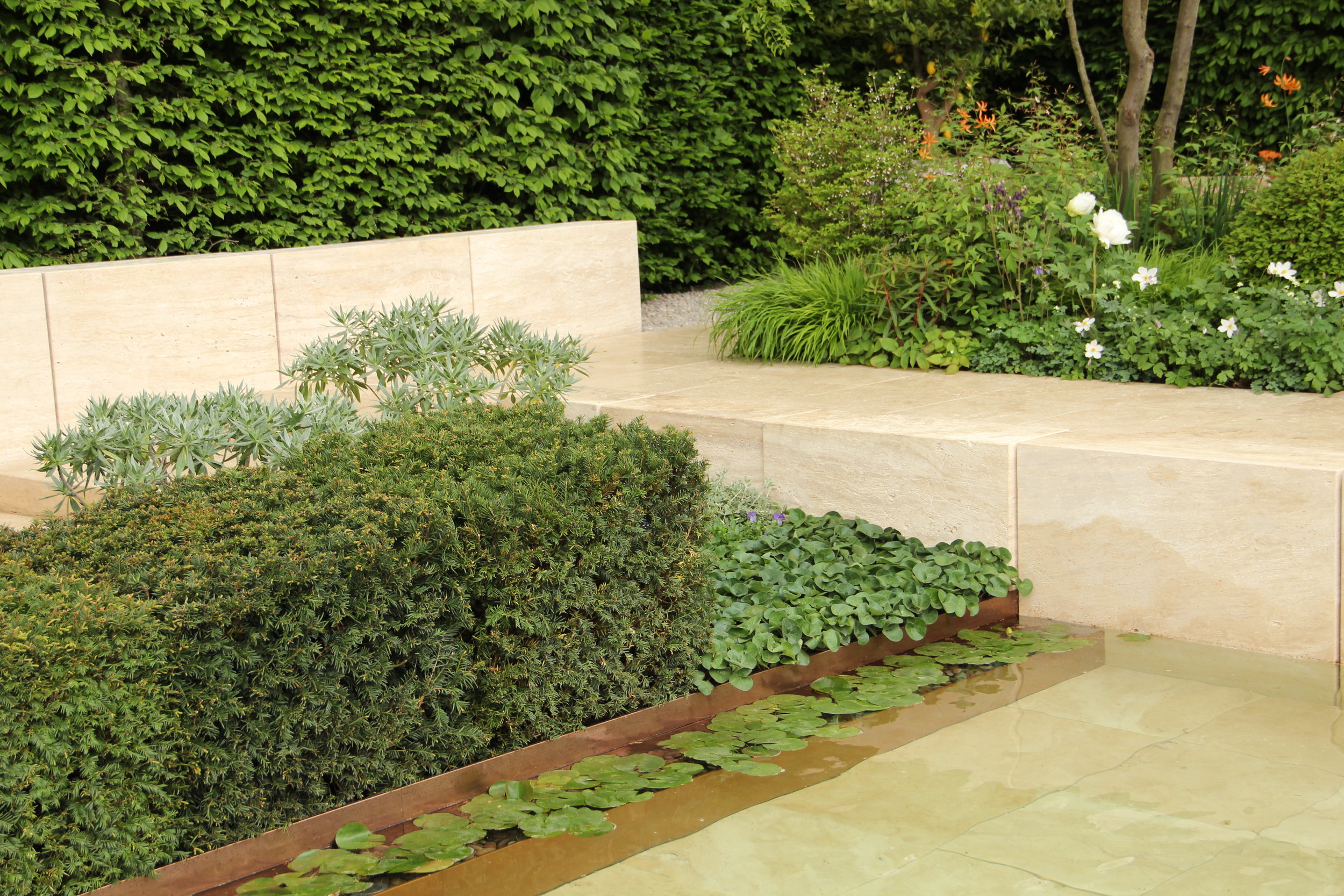
The third garden design was created by Ulf Nordfjell for the Laurent-Perrier Gardens. His modern idea was inspired by a design that was created by two female designers in the 80's, which was a garden comprised of sculpted forms. The plants chosen came from a very soft color palette of blues, purple, pinks, grays, and whites, with a soft orange unifying the whole scheme, encroaching slightly upon the feeling of a Mediterranean garden. These colors chosen were softly whispered in the hard materials of stone, copper and wood.
J- While I did enjoy certain details of this garden, it did not really seem to grab me the way the others at the flower show did. If the garden was a little more wild, rather than restrained, it would have struck me differently but it appeared a bit too controlled.
E- I have seen Nordfjell's previous Chelsea show gardens, and his garden this year hardly vacillates from the formula. The Nordic penchant for soft colors is evident as well as the minimalist, contemporary structures. I enjoyed the use of Quercus robur (Fastigiata Group) 'Koster' rather than the standard, cliched birches. The pergola arches, as handsome as they are, feel like an uninspired rehash of the same ones in various show gardens, and the bronze Orpheus sculpture is difficult to see against the hedge. Overall the spatial transitions flow well together - nothing seems disjointed or contrary to the atmosphere.
J- Always loving a good color story, and how the orange blooms picked up the brighter hues in the stone, I found that playful enough but for me a garden should create more emotion, and this fell short. Living in a garden like this I might feel underwhelmed and want to color outside the lines more.
E - I wonder if the staid color scheme was from the difficulty garden designers had procuring flowering plants from growers this year. Nonetheless, it's a welcome change to see Nordfjell embrace orange after whites, greys, and blues typically characterize his planting style. A brighter orange, rather than the soft hue of these lilies (Lilium 'Orange Marmalade'), could have lifted the planting more - perhaps through orange geums and rusty foxgloves while keeping the existing plants. However, Nordfjell did use echiums, which can give the garden the color jolt it needs. Just imagine the bright blue flowers with their electric pink stamens against the pale walls.
J- In the pool of water there was a submerged planting bed for water lilies and I imagined in a few years time, having spread further across the water, that it be a welcome addition to the restraint found in the rest of the garden.
E- I feel conflicted about the yew blocks set close against the metal edge. The blocks do echo the stonework and give a living ballast, but part of me aches for something less rigid (perhaps more of those echiums?). The waterlilies do echo the Asarum europaeum nicely.
J- Good point about the Asarum, I do love that plant, and the waterlilies. I did not notice that, nice one.
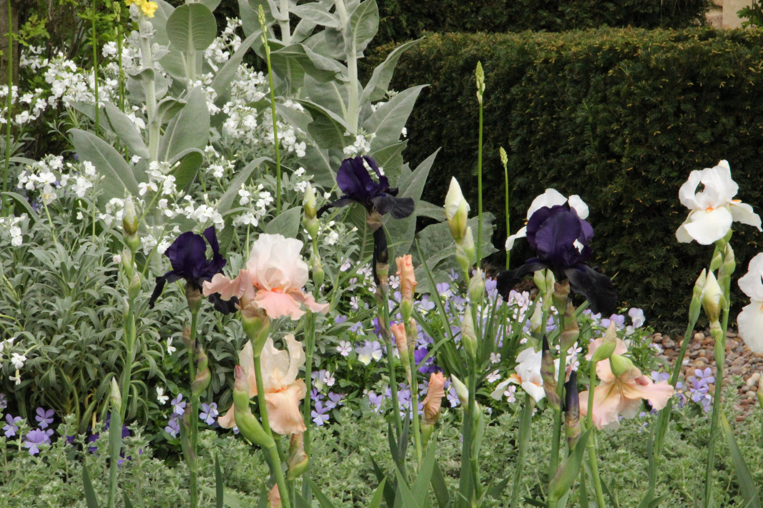
J- This area of the planting bed proved to be more exciting with its depth in color due to the dark Irises against the gray foliage. That peach and white bloom of Iris 'Sugar Magnolia' really lifts this combination. I would imagine myself entering my Mediterranean garden in the evening to cut all those beautiful blooms for an arrangement, while the moon floats on the horizon above the sea. It's nice when a garden transports you...
E- Bearded irises are always a Chelsea favorite, and I always remember those wonderful rusty irises at Tom Stuart Smith's 2006 Chelsea garden for the Telegraph. They make a presence again in this show garden. Colors still respect the Nordic aesthetic, yet given a renewed angle from the addition of the bearded irises, especially 'Sugar Magnolia'. Silvers come from Matthiola incana and Verbascum bombyciferum 'Polarsommer' and pale purples from Viola cornuta. Unlike the previous Chelsea Flower Shows I have either attended or studied online, I can't say that there was a clear favorite this year as each garden excelled in different ways.
--------------------
The Chelsea Flower show is always a good place to get ideas and to pick and choose details from, but it is never best to recreate something you see exactly. Always make your garden your own with what you like, rather than someone else's. Going with a critical eye and a good friend is not a bad thing either, and remember not only note the things you like, but always wonder how can I make this better. Happy 1oo years Chelsea Flower Show, and see you next year.....

